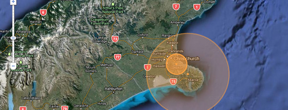
With Christchurch still in turmoil after today’s devastating earthquake, Paul Nicholls of the University of Canterbury, N.Z. has created a fascinating – and rather disturbing – animated map plotting seismic activity in the area.
4,900 quakes in less than a year
Set up after the magnitude 7.1 quake in September 2010, the Christchurch Quake Map combines Google Maps with data from GeoNet, a service backed by the New Zealand government, to monitor earthquakes, tsunamis, volcanic eruptions and other natural hazards.
The animation graphically shows just how seismically volatile the area is, with nearly 4,900 earthquakes recorded in the region since 4th September, 2010.

To get an impression of the terrible events of the last day, select the ‘show 24 hours’ option.
Here’s how the author explains the site:
The Christchurch Quake Map on this website aims to present a time-lapse visualisation of the earthquake and its aftershocks, primarily to help those outside the affected area understand what those of us in Canterbury are experiencing.
It plots earthquake data from GeoNet (note: GeoNet’s recent quakes list does not list all quakes) on a map using the Google Maps API, with the size of the circle denoting the magnitude (the higher the magnitude, the larger the circle) and the colour showing the focal depth (see the legend below the map).
How to use the MapWhen you visit the map, it will start playing through the earthquakes once it finishes loading. You can pause and resume using the controls to the right of the map, and also jump to the start or end, speed up or slow down the playback. The “Jump to” links beside the map allow you to start playback 3, 6, 9, 12 or 24 hours before the current time, so you can see just the latest tremors.


