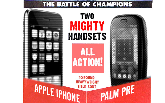
We’ve been repeatedly asked which is the best phone between the sprightly contender Palm Pre and the all-conquering Apple iPhone 3GS, so we thought we’d put them in the ring together and let them slug it out over 10 rounds.
It’s going to be quite a scrap, so pull up a chair and check out the action. The two heavyweights will thump it out over ten rounds in two parts, with the final part following soon. Ding ding, seconds out!
Round 1. Build quality
The Pre is reasonably well built: the sliding mechanism seems satisfyingly firm and the phone looks solid enough to take a few bashes, and there’s something very satisfying about its compact dimensions.
However, the iPhone’s high build standard and robust construction means that it’s walking away with this round.

Round 2. Looks
Clearly this is subjective stuff, and it’s a tough call between the iPhone’s utilitarian good looks and the Palm’s, smooth, pebble-like form.
The iPhone’s design is more or less unchanged since the handset was introduced back in 2007, and while it still looks a lot more elegant than many of its imitators, it is starting to look a bit dated to our eyes.
True, the Pre’s no stunner, but we think it just edges this one, mainly because it feels so damn good in the hand.

Round 3. Operating system
The iPhone set the bar for usability and ergonomics when it was first introduced, and despite a parade of rip-offs and ‘inspired by’ handsets across multiple OSs, nothing has come close. Until the Palm.
Spend some time with the silky smooth webOS and once you’re accustomed to its gesture driven interface, full multitasking, synergy contact management and universal search, the iPhone starts to feel a little bit, well, Windows98. The Palm’s walking away with this round.

Round 4. Apps
Although Palm’s App Catalog is slowly filling up, it’s got a long, long way to go before it can even get close to the iPhone’s immense bill of downloadable fare.
We’ll concede that most essential applications are already present and correct on the Pre, but the rich array of apps in Apple’s AppStore puts the iPhone in a completely different league. Slam! Take that Palm!

Round 5. Gaming
Once again, the iPhone’s lead here is almost embarrassing, with a huge selection of excellent games available for download.
The Palm is still getting off the ground as a gaming platform, and recent DOOM! and Quake ports suggest that it’s gaining ground rapidly, but right now, they’re lying face down in the canvas, reeling after another formidable right hook from the 3GS. This is looking like a walkover!

TIME OUT! The verdict so far:
At the half way stage, it’s turning out to be a real tough battle, with the Apple iPhone 3GS narrowly ahead on points and the Pre bloodied, but still in the game.
What will Palm come out with in the upcoming rounds? Has it got a knockout punch up its sleeve? Will the magic sponge do its work? Or will the towel be thrown in as the Killer iPhone ruthlessly slaps down another wannabe?


As a relatively new Pre user, I’d disagree that the apps are present and reasonably correct on the Pre. SMS that doesn’t count characters? Facebook app where you can’t include a caption with your photo upload? However, hardware is no contest. It is really nice to have a physical keyboard if you’re doing e-mail. And even though the Pre camera is only 3 megapixels, I think the lens is better than the iPhone’s. If you’re not planning on printing posters from your pics, megapixels don’t matter as much as lens quality.
That doesn’t make sense! How can it win on how it feels in the hand when that’s not how it looks?!
@Sharon: you can download the free Friendsbook app that lets you include captions with uploaded photos.
@Leon: As I said in the review, the iPhone looks a little dated now, but its the mix of the Pre’s looks and how its design translates into good ergonomics that gives it the edge.
Mind you, I don’t expect everyone to agree with the verdict – which is being written now!