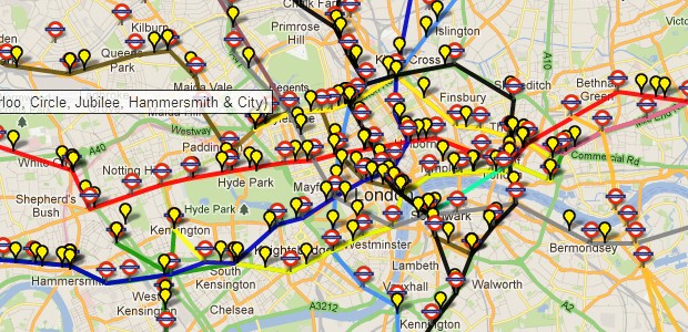
This neat map shows the locations of all the tube trains currently traversing the London Underground network in approximate real time .
Created by Matthew Somerville and originally built at Science Hackday, the map uses live departure data from the TfL API, and then does a bit of ‘maths and magic’ to get the tube train icons shimmying across the screen.
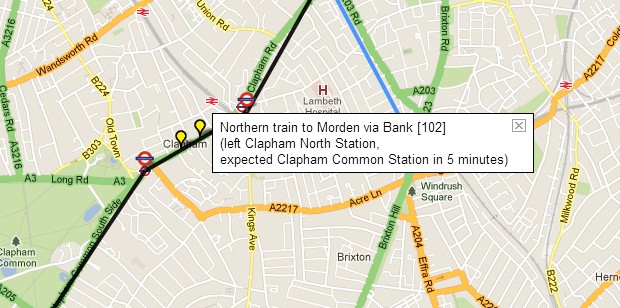
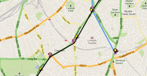
It’s possible to zoom into the map to get more detail, and clicking on each station produces a small local map, while clicking on train icons adds information about the individual service.
It all worked impressively well for us (apart from occasionally seeing a tube train making a dash for freedom and hurtling along non tubes lines at high speeds), but the author explains that there’s still a few small bugs in the system:
A small number of stations are misplaced or missing; occasional trains behave oddly; some H&C and Circle stations are missing in the TfL feed.
There’s also a natty Skyfall version, with the author alos creating a per-station National Rail version, and an bookmarkable train times journey planner.

