Until yesterday, Bit.ly was absolutely perfect for quickly sharing an interesting webpage across multiple Twitter and Facebook accounts
Thanks to its handy Chrome bookmarklet, sharing a page was as simple as clicking on the toolbar icon and seeing a box pop up showing the the page title and automatically shrunk URL.
Then it was a case of adding your text and ticking off which accounts you wanted to send the message to.
Quick. Simple. Easy.
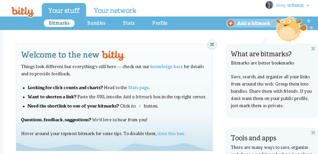
But now it’s turned into some hideously confusing ‘social’ offering, with bafflingly pointless new additional services like ‘bundles’ and ‘curators’.
We had no idea what these were so headed off to their help pages.
We can’t say their answers helped enlighten us much:
What happens if I add a private bitmark to a bundle?
If a bitmark is marked private in ‘Your stuff’, but added to a public bundle then the link will surface publicly in the bundle, but remain private in ‘ Your stuff’.How do I add a curator to a bundle, and what does that mean?
Go to your bundle and click on ‘manage curators’. To send a curation invite enter either the bitly username of the curator or their email address. If your friend is not already using bitly- it’s easy to sign up via the curation invite email that is sent out.
After spending some time trying to make sense of this – and just get back the functionality we liked in the first place – it seems that whatever you do, it will now involve more clicks.
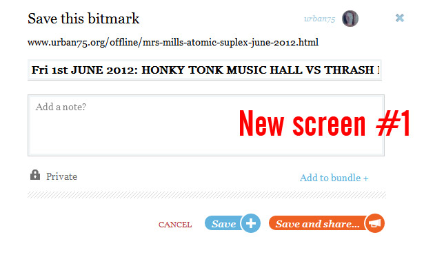
Where a simple box would pop up, now you have to work your way through two screens to get anything done, and it’s confusing as to which bits of text will actually appear in the post.
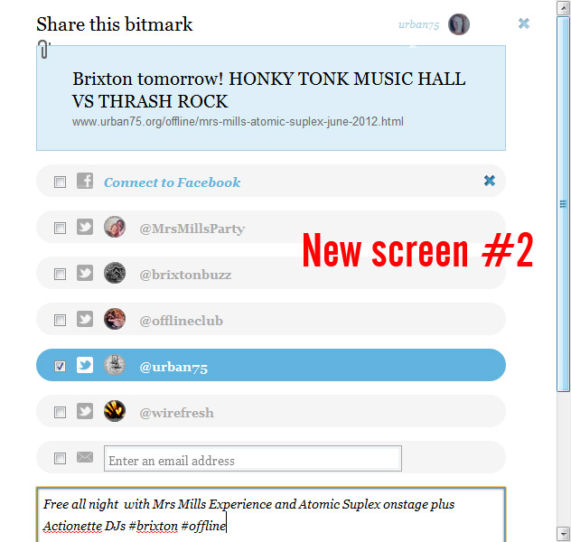
Anyone hoping to quickly be able to copy the shortened URL is in for a disappointment too, as that only appears on the second screen.
It’s an awful, awful change that makes users jump through pointless hoops just to get the job done. Please put it back to how it was, bit.ly, or we’ll have to go elsewhere.
It’s not just us that’s peeved with these changes either, check out the venting going on at Bit.ly’s blog here: http://blog.bitly.com/post/23998132587/welcome-to-the-new-bitly#disqus_thread

