Web research and usability bod Jakob Nielsen has posted up a blog entry called, “Scrolling and Attention,” which concludes that web designers are better off shoving all the important content in the top half of their pages, for fear of attention-deficit surfers wandering off elsewhere.
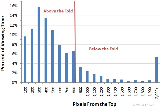
Nielsen’s study found that surfers spend 80% of their time looking at information above the page fold, adding that, “although users do scroll, they allocate only 20% of their attention below the fold.”
The fold explained
In case you’ve no what or where this mysterious “fold” is, let us explain: “above the fold” is the part of a web page that’s shown in your browser, without scrolling. Any content below this is, as you might expect, is deemed to be “below the fold.”
With most surfers having the attention span of a hyperactive gnat on crack, Nielsen argues that the further they have to scroll down a page, the less attention they pay to the content:
It’s as if users arrive at a page with a certain amount of fuel in their tanks. As they “drive” down the page, they use up gas, and sooner or later they run dry. The amount of gas in the tank will vary, depending on each user’s inherent motivation and interest in each page’s specific topic.

Analysing data from 21 users accessing 541 different Web pages, the study found that users spent 80.3% of their viewing time looking at the content of web pages above the fold (based on a fairly standard screen resolution of 1,024 × 768 pixels), although some will read even the longest pages through to the bitter end.
Curiously, the last element on a page was often found to attract additional attention, a fact reflected in the conclusion to the article:
Design Implications
The implications are clear: the material that’s the most important for the users’ goals or your business goals should be above the fold. Users do look below the fold, but not nearly as much as they look above the fold.People will look very far down a page if (a) the layout encourages scanning, and (b) the initially viewable information makes them believe that it will be worth their time to scroll.
Finally, while placing the most important stuff on top, don’t forget to put a nice morsel at the very bottom.


