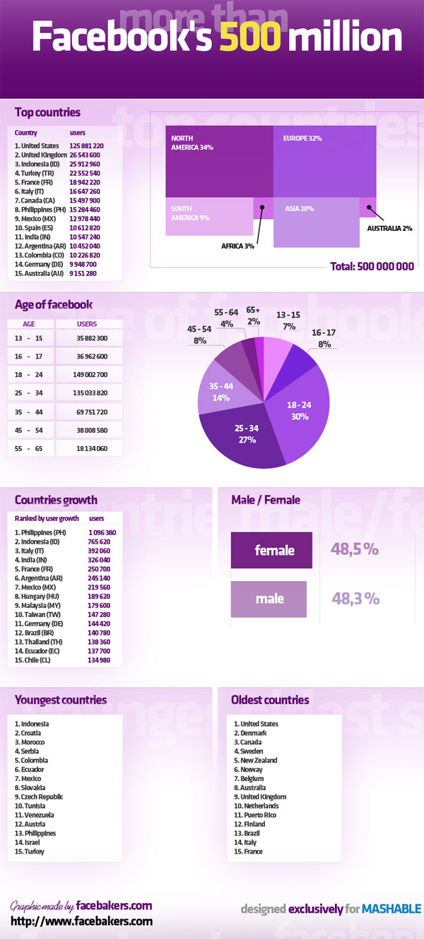
You can’t go wrong with a nice colourful infographic, so what better way to show off Facebook’s achievement of signing up its 500 million member than with a mouse wheel-troubling monster graphic?
Hewn from a block of solid pixels, the designers at Facebakers.com have knocked out a comprehensive infographic displaying the demographics of Facebook’s growing population, with a breakdown of the international make-up of the site.
Scroll on and absorb…

[Via]


Interesting that Germany, with a higher population than the UK, has far fewer Facebook users.
Do they use another website, or is social networking less common over there?
Here’s the breakdown by % of population- (I’ve used wiki for the populations and rounded to the neareast .1 million so take them with a pinch of salt)
1. USA 125.9 million FB users 309.8 million people 40.6% of the pop use Facebook
2. UK 26.5 million FB users 62.0 million people 42.7% of the pop use Facebook
3. Indonesia 25.9 million FB users 234.2 million people 11.1% of the pop
4. Turkey 22.6 million FB users 72.6 million people 31.1% of the pop
5. France 18.9 million FB users 65.4 million people 28% of the pop
6. Italy 16.6 million FB users 60.3 million people 27.5% of the population
7. Canada 15.5 million FB users 34.1 million people 45.5% of the population
8. Philippines 15.3 million FB users 94.0 million people 16.3% of the population
9. Mexico 13.0 million FB users 108.4 million people 12% of the population
10. Spain 10.6 million FB users 47.0 million people 22.6% of the population
11. India 10.5 million users, shitloads of people, less than 1% of the population
12. Argentina 10.5 million users, 40.5 million people, 25.9% of the population
13. Columbia 10.2 million users, 45.5 million people 22.4% of the population
14. Germany 9.9 million users, 81.8 million people 12.1% of the population
15. Oz 9.2 million users, 22.4 million people, 41.1% of the population
So Canada, UK, Oz and the US are the Facebook addicts of the globe, with a surprisingly high figure for Turkey (for what is still a fairly poor country) and a surprisingly low one for Germany.
Er… so if 48.5% of users are female, and 48.3% are male, what are the others?
We used our BI software to generate an interactive dashboard to display the data concerning Facebook’s 500 million users. Now you can visualize it, you can see so much more than just a number!
The dashboard contains 3 visualizations which all show different relationships.
The first, the treemap, shows the number of users in July 2010 in relation to the percentage penetration (number of people on Facebook as a percentage of the country’s population). The size of each individual box within the treemap shows the total number of Facebook users in the country. The strength of the color shows the percentage penetration, with the darkest blue being attributed to a higher percentage of users, and the lightest blue being attributed to the lowest.
The second visualization is the geovisualization, or heat map. We have chosen graduated circles to display the information but you can change it back to the original heatmap format by clicking on “Rendering Mode” in the bottom left hand corner. Here we see the relationship between the population and the percentage penetration. The size of the graduated circles show proportionately the population size, and the number inside demonstrates the percentage penetration. A very simple but a highly visual representation, the heatmap is probably the best way to get an overall geographical idea of where Facebook’s users are around the world.
Lastly, our third chart is the classic pie chart. We have used the filters to filter out any country with a population of less than 10 million. This gives us a nice overview of the relationship between the percentage penetration and the number of users. We have also chosen to display the percentage penetration measure by size, to make it really clear which countries have a high percentage (USA, UK) and which have a low percentage (India, Mexico).
Access the dashboard here: https://newsletter.bimeapp.com/players/dashboard/077077D2E5C3ACE47B43366C09E17404