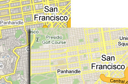
 It’s certainly subtle, but Google’s recent tweaking of their Google Maps application reflects their commitment to keeping punters happy (and perhaps warding off Apple’s possible incursion into their territory).
We have to say you’d need to be a bit of a hardcore Google Maps user to immediately spot the differences.
If we hadn’t read Google’s blog, we certainly wouldn’t have spotted anything, but the company posted up some ‘before and after’ comparison screenshots where the changes become apparent. Well, sort of. If you look closer..
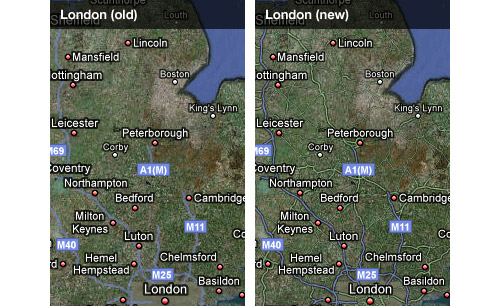
Google describe the changes thus:
The changes affect both the ‘Map’ and ‘Hybrid’ styles, and include numerous refinements to colour, density, typography, and road styling worldwide. For example, in map view, local and arterial roads have been narrowed at medium zooms to improve legibility, and the overall colours have been optimized to be easier on the eye and conflict less with other things (such as traffic, transit lines and search results) that we overlay onto the map. Hybrid roads have gained a crisp outline to make them easier to follow, and the overall look is now closer to an augmented satellite view instead of a simple overlay.
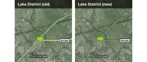
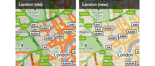
So what do you think of the changes? Are they for the better, or do you prefer the old look?


I thought this looked different when I was using it the other day, but told myself I was imagining it.
Glad to know I’m not going mad!!
The changes are hardly overwhelming though!