A new Google Maps update for Android and iOS looks to serve up a cleaner interface with less distractions and visual clutter.
As Google explains, the world is full of information, which means that highlighting the necessary info on the map without overloading the interface can be a tough balancing act.
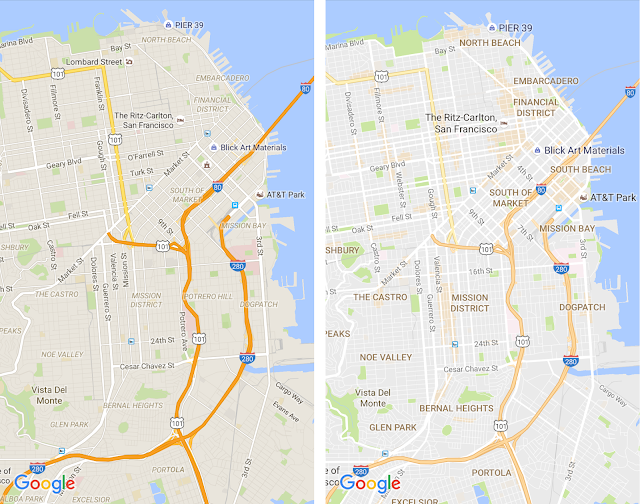
So their new update removes elements that they feel aren’t absolutely required (like road outlines), producing a cleaner map that makes it easier to see helpful and actionable information like traffic and transit.
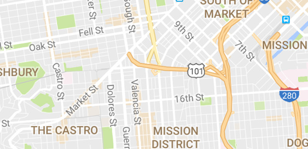
Google have also improved the typography of street names, points of interest, railway stations, and more to make them stand out more on a map, and introduced areas shaded in orange representing “areas of interest.”
These are places where there’s a lot of activities and things to do, as Google explains:
To find an “area of interest” just open Google Maps and look around you. When you’ve found an orange-shaded area, zoom in to see more details about each venue and tap one for more info. Whether you’re looking for a hotel in a hot spot or just trying to determine which way to go after exiting the subway in a new place, “areas of interest” will help you find what you’re looking for with just a couple swipes and a zoom.
The company have also tweaked the colour scheme to make it easier to differentiate between man-made or natural features, and quickly identify places like hospitals, schools or highways. See the guide above to see what each colour on the map represents.
See more in the video below:
SOURCE: Google Maps


