Filmmaker and YouTuber Simon Cade has created an essential and straightforward guide on how to get great movies out of your digital camera.
The guide talks you through the basics of creating cinematic footage and is stuffed full of some very useful tips.
What makes a great looking movie? Simon explains that Composition, Lighting, White Balance, The Exposure Triangle, Picture Style and Colour Grading are all vital elements to create that lush cinematic look, and the video (above) gives a great overview on how to best achieve the best possible results.
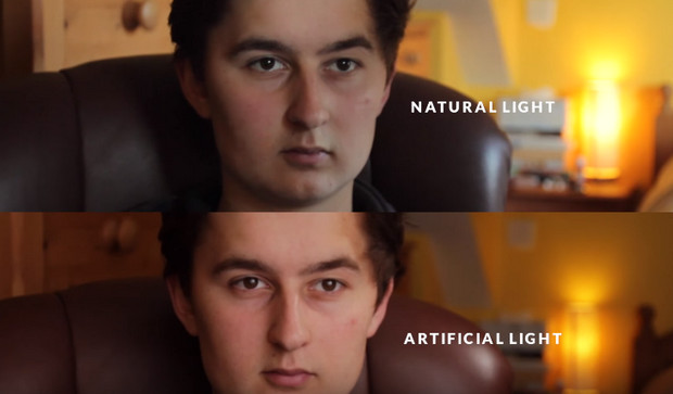
He provides a handy overview on his blog:
COMPOSITION
The bread and butter of visuals, this is an art form that we can always learn more about. Influences from other filmmakers + photographers along with our own ideas for creating depth and emotion through space and location.WHITE BALANCE
The often overlooked setting: accurate white balance which provides a neutral starting point for color grading. Traditionally in cinema, most shots in most movies have pretty neutral colours, unless night scenes / sunset / artificial light etc.LIGHTING
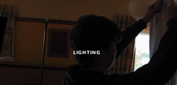
Lighting is so often mistaken for ‘good settings’ or a ‘good camera’. Lighting can make something beautiful, show us the time of day, or make something look dark and grimy. An energetic back light, or a creamy soft window light. Shaping light is what cinematography is all about.SHUTTER SPEED + ISO
Usually once you’ve got the shutter speed set to 1/50th (or 1/48th if possible) then it stays there for most of the time. Unless you’re going for a choppy / blurry look, most films tend to keep it around 1/48th. Unless shooting slow motion, in which case it can be easily calculated by doubling the frame rate: 24fps = 1/48th, 100fps = 1/100th. That way when it’s played back at normal speed, it will have a ‘normal’ amount of blur.PICTURE STYLE
The idea is that we can hold more detail in the shadows and highlights if we lower the contrast and saturation while filming. Then when we go to add it back in post, we have more room to work in, and so a greater dynamic range. I made the switch to VisionColor a few months ago after hearing multiple people saying that 8bit H.264 footage isn’t really designed for the heavy color correction involved with adding lots of contrast to a super flat image. VisionColor‘s less flat profile should have less banding / artifacting issues.COLOR GRADING:
The color grading plugin I’ve been using for over a year now (as seen below) is having a big discount (1/3 off) for Black Friday, so this is probably the best deal you’ll get on it all year:
There’s more here on Colour Grading:
Get more great advice from Simon on his website.
