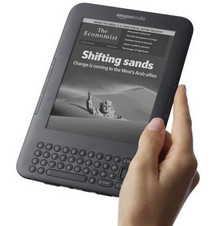
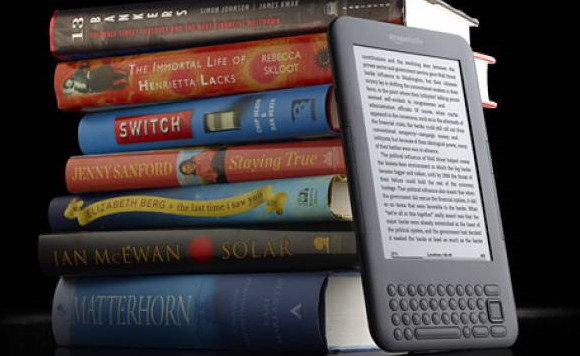
 One of our readers managed to collect his Amazon Kindle 3G today, and has kindly forwarded his first impressions of the innovative eBook reader.
We’re hoping to get our hands on the device later and post up some photos and our own impressions, but here’s ‘Memespring’s’ hands on report:
Hardware
It’s a really nice size and weight, and has a rubberised back so it rests in your hand well with no accidental catching of buttons which are just out of the way enough.
The keyboard perfectly serviceable, doesn’t get in the way, although I did find myself using the teeny-tiny enter key and the home key much more than the big button which seems a bit arse about face. They would probably be better merged together and made contextual.
Perplexing paddles
I also don’t really understand the 4 paddle buttons. I initially kept on assuming that left was ‘back’ and right ‘forward’, but there are infect two of each with the back button above the forward one on each side.
That goes against the well known browse behaviour over just about every other bot of software on the planet, so is an odd design decision.
The 3g worked out of the box and setting up Wifi was just a case of entering the details, with no annoying prods to join a network like there is on an iPhone.
Weirdly, you can’t use and be connected to a PC at the same time which is a bit odd if you are used to a smart phone.
Reading
Reading single pages is brilliant, even glancing at it from the side of your eye it is as readable as paper. It actually looks like those example mobile phones they used to have in shops with the interface stuck on a s a sticker. Although it is slightly off-white, I’d argue that is less so than an old paperback.
Reading is much more relaxing than on a phone or a computer screen and it feels very natural. When reading at a normal rate the ‘page turn’ is fast enough and low key enough to fade into the background.
However if you are flicking though multiple pages, as I was with the manual, it does get a bit annoying (there is no equivalent to the action of flicking through the pages of a book).
When you are reading you can lookup words in the dictionary inline which is brilliant, although it needs wikipedia as per the iPhone version to be totally killer. Most of the things I want to look up are people or places rather than just the meaning of words.

Interface
This is the only place it really lets itself down. Compared to an Apple / Google product the (non-reading UI, navigation etc) is very second rate.
The interface switches from pagination to scrolling seemingly at random, meaning you have to leave to use the paddles of the 4-way navigation depending on the type of page you are looking at.
Similarly, because there is both a ‘Page back’ button and a ‘Back’ you can easily find yourself getting lost especially when looking something up in the dictionary as ‘Page back’ takes you one page back in the dictionary, rather than back to the thing you were reading.
There is also some strange jargony language. e.g. if you search it says found at “Location 1211” what’s that mean? I think it means “page dependent on font size”. It also switches between a hand icon and underlining for selecting things and is inconsistent in how it delineates document types (PDFs are marked, magazines are not).
Within books the table of contents is hard to get to, especially annoying for magazines.
Finally, the browser is very clunky, and hard to use with all the page refreshing that needs to go on when navigating a complex page. There is a great ‘Article view’ which strips out images and text, but it doesn’t remember you selected it between page loads, so you have to load every page twice.

Getting stuff on it
The store is probably the one good bit of interface design. It’s very simple to find and download books (although sneakily they don’t list prices on the search results, only on the download page).
I had already subscribed to the New Statesman via my laptop, and the latest edition automatically arrived after I turned it on.
I’ve set it up with Instapaper so things I save when browsing on my laptop get sent to my Kindle bundled up as a magazine. This is the killer function for me.
You can also send documents by email. I tried sending a word document to it and it arrived 30 seconds later formatting mostly intact (an image got moved a tiny bit). You can also drag documents (.pdf, .doc etc) directly onto it with no fuss.
PDFs keep their format, but the text can be a bit small, so I’d rather it converted to kindle format or better still, give me a raw text / article mode option like with the web browser (again it’s all a bit inconsistent).
More soon!


