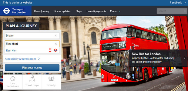
Transport for London has released a beta version of its handy website for planning journeys – and it’s brighter, cleaner and all round jolly well nicer than before.
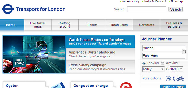
Above is the shiny new home page – compare with the dowdy old design below:
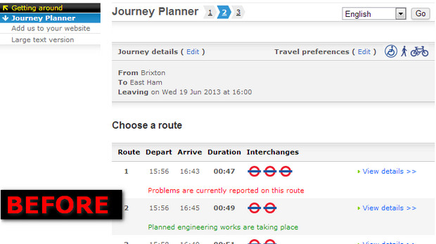
The results page has also had an industrial sized sprinkling of fairy dust, with the choices being presented in a much tidier format – see the before and after screen grabs here, starting with the fusty Ye Olde Interface:
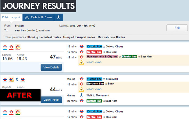
The new beta results page below is a far more pleasant proposition, and gives out detailed route information in a much more logical fashion too.
The website can also finally tell when a postcode it a postcode – this was something that used to be a source of annoyance for many – and with TfL promising to add new tools and pages in the coming months, we’ll be looking forward to the changes.
Good work TfL!


Like many ‘upgrades’ I feared it might slow my aging IBM thinkpad to a crawl. But no, it works quickly and smoothly even on this old thing.
Can only echo the ‘good work’ sentiment.