Palm’s Spartan stall at the PlayBite event may have been a seriously under-whelming affair, but at least we got to finally have a play with their eagerly awaited Palm Pre handset.
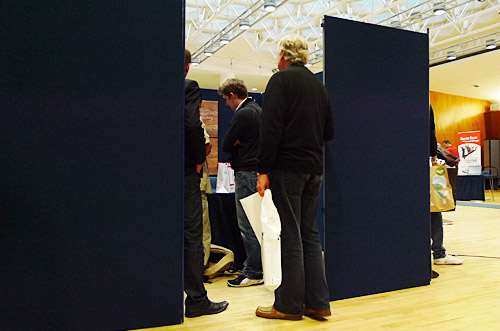
Once we’d squeezed into their frill-free and almost comically crap bijou booth and introduced ourselves, we were able to get our sticky mitts on one of just two pre-production Pres available to journos.
The first impression was – blimey, it’s tiny! Perhaps we’ve got used to the comparative bulk of the Android G1 we’ve been using for the last six months, but the Pre sat perfectly in the hand, with its pebble-like form making a comfortable fit.
Switchblade keypad?
Cautiously flicking open the keypad (we’d heard reports of a razor sharp lip lurking inside), we immediately started bashing away at the keypad and found it surprisingly easy to use – certainly better than the G1’s low slung affair, and definitely preferable to bashing away on the unyielding surface of a virtual keyboard.
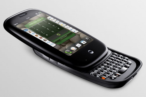
The action of the slider was firm and without some of the wobbles that seemed to have afflicted earlier models.
We found that the lower edge of the phone did get in the way a bit when we were hitting the upper keys, but soon adjusted our typing style accordingly, while the much feared sharp edge of the keyboard casing didn’t live up to its reputation. Perhaps Palm could have smoothed the edges a tad, but it’s hardly a major issue.
Display and Interface
The display can only be described as sensational. Sharp, crisp and stunningly bright, it’s one of the best we’ve seen on any phone.
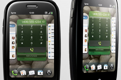
The interface was every bit as buttery smooth as the videos suggested. The card concept is quick to get your head around and we were soon flicking cards around the screen with gusto and multi-taskin’ like a mutha.
Not so intuitive is the ‘gesture area’ which needs a bit of learnin’ before you can grasp its workings, but overall we found the Palm’s webOS to easily be the equal of the iPhone.
In fact, we preferred it, although the platform currently lags a considerable distance behind the iPhone when it comes to third party apps.
Camera
It may only be a three megapixel affair, but it’s the best we’ve used on any mobile camera for the simple reason it’s fast. Instead of the usual interminable wait for a mobile camera to finally find focus, the Pre’s snapper is ready in an instant. Even better, you can take another picture almost straight away.
There’s also a flash on board, although there’s no manual exposure controls available – perhaps they’ll arrive through a third party developer.
Judging by web reports, the camera is capable of pretty good outdoor shots, although we weren’t able to give it a proper test while confined to Palm’s Stalag-booth (in fact, we weren’t even allowed to take any photos of the phone, so we’ve had to make do with Palm’s official pics).
Built in apps
We quickly felt right at home with the built in layered address book, calendar, memo and to do apps, and the browser motored along in a fine fashion, with web pages looking great on the Pre’s 3.1-inch 320×480 resolution HVGA display.
We loved the ‘Synergy’ messaging interface which combines conversations across multiple sources into one chat-style view, and the Universal Search function proved a great way of finding things on the phone and on the web.
There’s expected to be some UK-specific apps pre-installed on the Pre when it launches (most notably, the BBC iPlayer), but all questions on this topic were met with awkward silences from the Palm team. Perhaps they were a bit grumpy after being confined to their dark blue box all day.
Touchstone
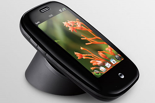
In line with Palm’s, err, minimalistic approach to the show there was no promotional material, no flyers and certainly no freebies on offer, and sat on the unadorned table was just one Touchstone charger .
Obviously, a charger isn’t much to get excited about, but we do like the concept and it seemed to work as advertised. Back in our office, there’s a hideous proliferation of blokey cables and tangled leads, so anything that helps clears up that clutter can only be a good thing in our book.
Pricing is going to be an issue, though. We’d like a tidy desk, but not if it’s going to cost us a crateload of beers.
Conclusion
After just a few minutes with the Pre, our Android phone began to feel like something out of the Stone Age, so the Pre’s UK release can’t come quick enough for us.
The webOS interface really is the star of the show, and although the build quality of the Pre can’t quite match the iPhone’s beautifully smooth lines, there’s enough innovation on show to make it a real contender to Apple’s all-conquering beast.
Sadly, there’s still no confirmed UK release date, although we know it’s coming to O2 and probably on October 31st. Naturally, we’ll be posting up a full review once the Pre is released out into the wild.
