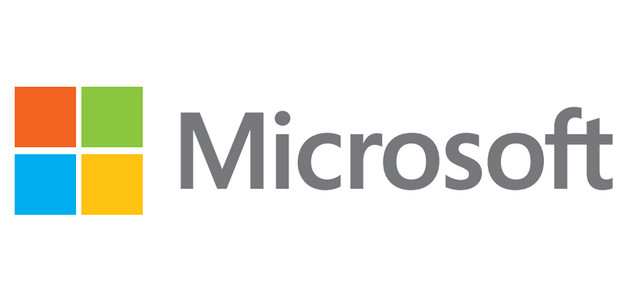
It’s been 25 long years since Microsoft last changed their logo, and the company is so chuffed with their new one that they’ve even released a video to show it off.

This time around their identity involves both a logotype and a symbol, with the logotype using the familiar sans-serif Segoe font, which Microsoft started using in 2004 (and not without some controversy).
The four squares of colour are designed to ‘express the company’s diverse portfolio of products’.

We rather like the new logo. It’s simple, unfussy and doesn’t come burdened with a load of designer tosh about its supposed aspirations.
Scroll down for the video and the full Microsoft press release:
Microsoft Unveils a New Look
In advance of one of the most significant waves of product launches in Microsoft’s history, today we are unveiling a new logo for the company.
It’s been 25 years since we’ve updated the Microsoft logo and now is the perfect time for a change. This is an incredibly exciting year for Microsoft as we prepare to release new versions of nearly all of our products.
From Windows 8 to Windows Phone 8 to Xbox services to the next version of Office, you will see a common look and feel across these products providing a familiar and seamless experience on PCs, phones, tablets and TVs. This wave of new releases is not only a reimagining of our most popular products, but also represents a new era for Microsoft, so our logo should evolve to visually accentuate this new beginning.
The Microsoft brand is about much more than logos or product names. We are lucky to play a role in the lives of more than a billion people every day. The ways people experience our products are our most important “brand impressions”. That’s why the new Microsoft logo takes its inspiration from our product design principles while drawing upon the heritage of our brand values, fonts and colors.
The logo has two components: the logotype and the symbol. For the logotype, we are using the Segoe font which is the same font we use in our products as well as our marketing communications. The symbol is important in a world of digital motion (as demonstrated in the video above.) The symbol’s squares of color are intended to express the company’s diverse portfolio of products.
Starting today, you’ll see the new Microsoft logo being used prominently. It will be used on Microsoft.com – the 10th most visited website in the world. It is in three of our Microsoft retail stores today (Boston, Seattle’s University Village and Bellevue, Wash.) and will shine brightly in all our stores over the next few months. It will sign off all of our television ads globally. And it will support our products across various forms of marketing. Fully implementing a change like this takes time, so there may be other instances where you will see the old logo being used for some time.
We’re excited about the new logo, but more importantly about this new era in which we’re reimagining how our products can help people and businesses throughout the world realize their full potential.


