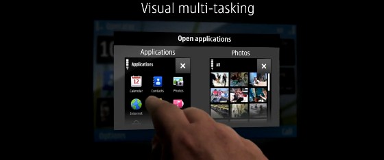
Symbian’s finally gone all finger friendly in their new Symbian S^3 operating system, serving up a bright new UI that looks to have been heavily (ahem) ‘inspired’ by other platforms.
There’s multiple home page screens ready for your flicking pleasure, plus kinetic scrolling, swiping, pinch-to-zoom and a rather jolly “visual multi-tasking” option that looks like Nokia’s been getting jiggy with a Palm Pre. All. Night. Long.
Naturally, there’s more widgets onboard than you can throw a widgety wombat at, customisation options galore and a media player application that looks as close to Apple’s Cover Flow UI as you can get without suspicions of inter-marriage.
Although it looks unlikely to be nominated for the Original Interface Awards 2010, the polished up interface seems rather fine and dandy to our eyes, but see what you think from the video below:


LOL! It’s just an Apple/webOS rip off – but a year too late!
Compared to what Microsoft has just produced, this looks well lame.
Symbian really are going to continue to struggle if this is all the innovation they can come up with.
Remember when the N95 came out? That phone was ahead of the game, and now they’re miles behind.