
So, the Apple iPad has been out in the UK for several days now, launched with the most ghastly whoopin’, high fivin’, clappin’ and cheerin’ celebration of luxury consumer item spending you’ll ever see in the UK.
I’m not fond of standing in queues being flesh-pressed by over-excited, squawking, cult-like Apple employees, so instead took time out to have a more sedate hands-on with Apple’s exciting new product over a weekend.
Crisper than a crispy thing
Picking up the thing the first impressions are overwhelmingly positive: it’s a lovely piece of beautifully executed design and the screen is deliciously crisp and bright. It looks gorgeous.
It certainly feels substantial too, with the kind of sleek, modern lines that make most notebooks – and all of the hastily rushed PC tablet alternatives – look clunky and awkward.
It”s a fair bit heavier than I expected at 680g, and it actually became uncomfortable to hold after a while: I wouldn’t want to have to hold this unsupported for too long.

Web surfing
Web pages looked ruddy fantastic, and it was a joy to surf sites on the iPad’s crisp, shiny screen, although the lack of Flash support spoiled the experience on some sites.
No matter how Steve Jobs tries to spin it, the absence of Flash can really deter from the overall experience, and the iPad can never claim to be “the best way to experience the web” when it’s effectively censoring so much useful content.
Apps
Some of the apps I played with were just giant-sized iPhone apps, and I didn’t really see much benefit in blowing them up, but Google Maps looked sensational – better than on any other mobile device I’ve seen before.
(Note that you’ll have to fork out for the 3G version to enjoy full GPS functionality with Google Maps as the Wi-Fi only version can only approximate your location using local Wi-Fi networks.)
The car racing demo was fun and fast too, and underlined the fact that the iPad could be a great (albeit rather expensive) gaming platform, while videos looked absolutely lush.
If the tablet was lighter, it could be the perfect mobile movie viewing and photo viewing device.
Kindle killer?
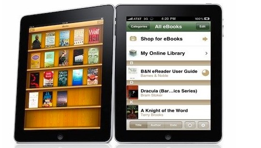
The iPad has been touted in some quarters as a ‘Kindle killer’, and although text looked fabulously sharp on the iPad’s 9.7″ screen, the backlighting means that you can expect eye strain to start kicking in well before you finish a short novel.
It was a better story for magazine apps, with the large colour display making it a pleasure to flick through the pages, but unless there’s some worthwhile interactive ‘extras’ on offer, I wouldn’t fancy paying much for them.
The Wired mag app was hugely disappointing – a hefty 500MB of just passive content – and, besides, you can’t really take an iPad into the bath, and there’s where I like to read mags. Preferably with a can of finest Welsh ale to hand.
Business tool?
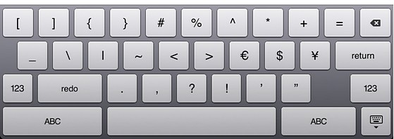
The keyboard was more usable than I expected, but I really wouldn’t like to use it for much more than short emails. No matter how good the auto-predicting software gets, it never feels right bashing away at a slab of non-tactile glass.
I currently use my netbook a lot for writing when I’m travelling light, and although a rather stylish external keyboard and matching stand is available as an extra from Apple, having to use one seems to defeat the point of the iPad.
Keeping the heavy tablet at an angle and trying to type would soon prove uncomfortable, and if I put it flat on a train table, I’d feel rather exposed to prying eyes and miss the privacy that a laptop lid can offer.
A netbook may not be such an elegant solution or serve up such a feast of multimedia eye candy, but it can certainly do a lot more everyday computing tasks than the iPad (although perhaps the forthcoming tsunami of apps may change all that).
The downsides
The current lack of multi-tasking is a killer blow too: not being able to keep chat windows, Twitter feeds, email and websites open is a real pain, and seriously hinders the iPad’s usefulness.
I know that this is set to change with the upcoming OS 4.0 upgrade, but I wish Apple would employ something more akin to the Palm webOS’s wonderful multi-tasking abilities.
Then there’s the thorny issue of Apple’s all-controlling ‘walled garden’ approach, with Steve Jobs’s increasingly moralistic campaign of censorship rubbing us up the wrong way and making us feel uneasy about supporting such practices.
No stylus
I know even the mention of the word ‘stylus’ sets old Steve Jobsie off on one, but we’d love there to be a Courier-like option to use a stylus for more precise tasks on the iPad.
Yes, we know that uber-artist David Hockney has managed to create painterly masterpieces on his iPad, but for most folks with an artistic bent, smudging a finger around the screen is not an ideal way to sketch ideas or draw a scene.
In fact, while we’re on a roll here, we have to say that the big button, finger friendly iPad interface can get mighty tiresome when you’re trying to do a moderately advanced task.
Having to bash your way through pages of child-friendly, over-sized buttons makes us yearn for an optional stylus to quickly bash through long lists of options, but we know that there’s no chance of one of those appearing in Apple’s plans.
What’s missing
The screen, while fabulously bright indoors, doesn’t fare so well in sunlight, and the lack of a built in camera/webcam is an annoying and rather baffling omission.
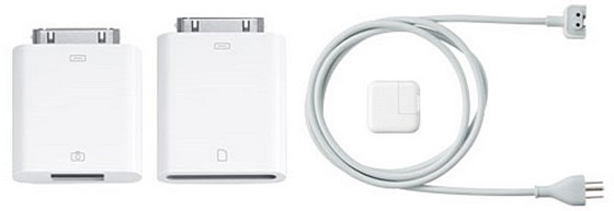
The lack of a built in USB port is pain too. Sure, I could invest in a separate USB adapter, but that’s just one more thing to lose/forget/break.
Equally annoying is the lack of a integrated SD memory card slot. I often use my netbook to back up, edit and publish photos taken with my compact camera on the move, and unless I shell out for another external accessory, that’s something else the iPad simply can’t do.
A HDMI out (or even a VGA, dammit) slot would have made the iPad perfect for delivering lectures too, and given me a reason to leave my netbook/laptop behind.
Conclusion
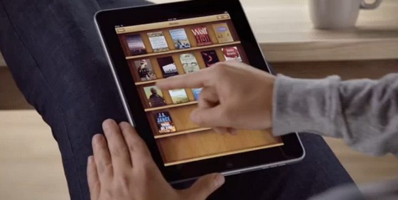
I enjoyed my time with the iPad: I admired its polished design, its ease of use and speedy operation, and could definitely find a use for it in my living room as a general media device.
Although some have suggested that it’s a netbook replacement, it’s clearly something different and as such I’m struggling to find what niche it can fill in my life.
It certainly has the ‘X factor’ and like many Apple products manages to induce irrational, wallet-lightening urges, but with UK prices starting at a hefty £400 – the highest prices in the world – I’m just finding it far too expensive, too heavy and too feature-limited to justify a purchase.
I found myself agreeing with Charlie Brooker in his article, where he concluded that consumers would be better off waiting until lighter and cheaper versions of the iPad become available – or perhaps seeing if any interesting rival devices appear in the coming months.
That’s certainly what I’ll be doing – if I can finally convince myself I even need a tablet device in the first place, of course.

“I’m not fond of standing in queues being flesh-pressed by over-excited, squawking, cult-like Apple employees!”
Looks like you made the right call…
From the Guardian link you posted….””After a 13-hour wait, it’s like giving birth. You’re in labour for 13 hours and you’re tired and exhausted, you’re hot one minute then you’re cold the next, and you’re in pain, but then there’s the ecstacy when you have this little thing in your arms.”
How sad can you get?
So ipad or not? Im tempted, but not quite. The limitations mentioned are pretty significant. I’ll wait for more widespread HTML5 adoption, multi-tasking, the next wave of apps and a webcam. Great review though, surprisingly balanced.