 Tech twitterers went totally ape over the weekend as details of what is said to an interesting new handset from Google leaked out.
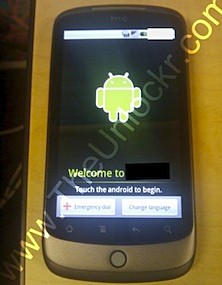
Followed up by the usual blurry photo of what looks like a fairly standard HTC-style handset, it seems that “tons” of Google employees have been given these phones.
A few have apparently gone on to show it off to their pals and drawn admiring glances with one calling it, “Like an iPhone on beautifying steroids.”
Mario Queiroz, a Google product manager, responded to the growing speculation with a fuzzy kinda comment, describing the handsets as a “mobile lab” being used to test “new mobile features and capabilities”. He also went on about ‘dogfooding’, which was certainly a new one on us:
An Android dogfood diet for the holidays, Saturday, December 12, 2009 8:58 AM
At Google, we are constantly experimenting with new products and technologies, and often ask employees to test these products for quick feedback and suggestions for improvements in a process we call dogfooding (from “eating your own dogfood”). Well this holiday season, we are taking dogfooding to a new level.
We recently came up with the concept of a mobile lab, which is a device that combines innovative hardware from a partner with software that runs on Android to experiment with new mobile features and capabilities, and we shared this device with Google employees across the globe. This means they get to test out a new technology and help improve it.
Unfortunately, because dogfooding is a process exclusively for Google employees, we cannot share specific product details. We hope to share more after our dogfood diet.
However, CNET’s Jason Howell went further with a detailed comment on a TechCrunch article
I was given the phone for a very limited time from a Google employee. It resembled an HTC Hero to my eyes, though a tiny bit smaller and DEFINITELY thinner. I kept looking over at the guy using it, thinking to myself that it WAS a Hero, but when I asked, he spilled the beans. Google employees were handed the phones today. He reiterated that there would probably be a decent amount of information hitting the tubes this weekend. With my limited time with the device, I saw it running Android 2.1. The home screen had this animated background image that looked nifty with red and blue lasers shooting across it. The gray bar at the bottom of the home screen was replaced with the “house” line art used on the face of most Android phones that takes you to the home screen. Looked sleeker. Super light phone too.
This phone was unlocked, though the guy had thrown an AT&T sim card into it.
That’s about all I was able to glean in my minute’s worth of dabbling. It was sleek and nice looking, but I am scratching my head trying to figure out what the real difference is between this and any of the newer HTC Android phones. Scanning the apps, I didn’t see anything that really stood out as different from what I have on my Droid. And being that it was Android 2.1, the only really differences I saw were a few visual ones. So it doesn’t appear (in its current state) to really be offering “the *real* Android” experience that’s mind blowingly different from what’s out there so far. Maybe I just didn’t dig deep enough to find it though.
As we went to press, the following details (or informed guesses/ mad stabs in the dark) have emerged about the phone:
It will run on the Android 2.1 OS, be manufactured by HTC and come with a capacitive touch screen, have an onscreen keyboard only (boo!), come with a scroll ball, and feature animated desktop wallpaper. It’ll also be a bit slimmer than an iPhone, with the entire user experience being designed by Google, who will also sell it online unlocked in January 2010.
Quite how much of this is true is anyone’s guess right now, but we’ll keep you posted.
Update: More photos posted here and more details of the interface;
….the updated OS features new 3D elements to the app tray, as well as an extended amount of homescreens, though it looks like the lock screen / mute is the same as in Android 2.0.1. Additionally, there’s now a new grid icon at the bottom of the homescreen, which when pressed brings up a webOS card-style preview of all homescreen pages


