After the Apple Maps debacle it looked like Google had been gifted an unassailable lead over its rivals, but it seems that the search engine giant seems to be busy setting itself up some own goals of its own and We’re not enjoying using the desktop maps as much as we used to.
We’ve already had enough trouble adjusting to the new, totally unintuitive way that Street View is activated.
Previously, you just dragged the little yellow bloke over the map and the areas where there was street view content available would be highlighted by a blue line.
Now you have to keep on clicking at random points on the map before the Street View thumbnail appears – something which can take some considerable effort if you’re looking at more obscure areas where there is no material available.
And if that wasn’t bad enough, Google also removed the Wikipedia layer, instantly taking away a useful piece of information.
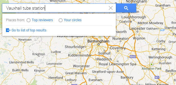
We could almost forgive Google for that if the search wasn’t getting so erratic. We just searched for ‘Vauxhall tube station’, a fairly major station on the Victoria tube line in central London.
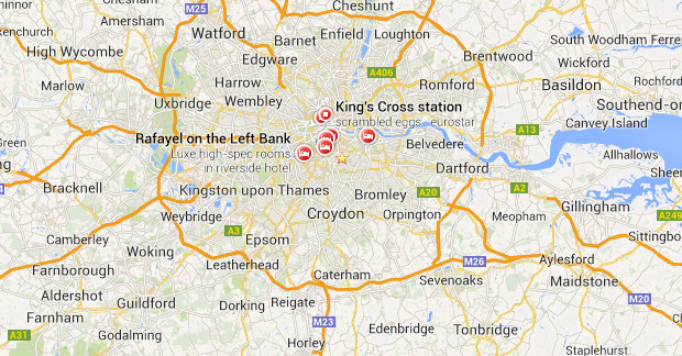
As you can see from the screen grabs above, Google threw up some very odd results. For some reason, bizarre captions like, ‘Rafayel on the Left Bank,’ ‘Scrambled eggs,’ and ‘Luxe high specs in riverside hotel’ appears over central London.
There is no sign of Vauxhall tube – but things were about to get worse…
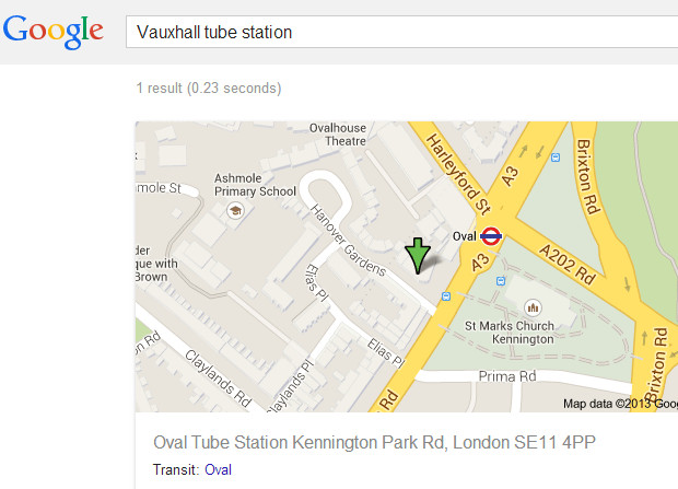
Clicking on the ‘Go to list of top results” link took us to a map of Oval tune station – which isn’t even on the same tube line!
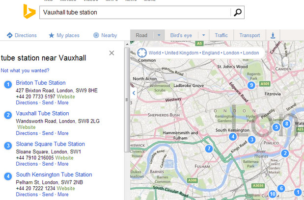
By comparison, Microsoft’s Bing Maps search (below) managed a far better stab at locating, although even that was a bit confused, listing Brixton tube above Vauxhall (but at least they’re both on the same line):
So what has happened with Google Maps? Why is it stumbling over something as obvious as a large tube station in London?
Any ideas?

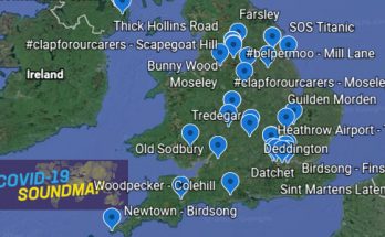

They’ve also stopped using the standard colours for A roads, B roads and Motorways for no good reason. A small thing for sure in the great scheme, but mighty annoying.
Try to google chicago airports. It doesn’t bring up O’Hare!
how the hell do i get directions to a point after i find it, left clicking, right clicking does nothing anymore
I have lost 1/3 of the map on my ipad 2 to a useless info bar I can’t seem to hide !
I gave up and switched back to mapquest. Had to. It doesn’t even load correctly on my 2 year old HP. Googled trying to find solution to the issue and found help instructions to go back to old Googlemaps which didn’t work. The menu options provided in help were not choices from which to select. Bits and pieces of things are everywhere so obviously doesn’t load correctly. Wow, I used googlemaps all the time. Oh well…. Good while it lasted….
I give up. This is terrible. Can’t use it anymore. Takes a long time to load, seems more complicated and not user friendly at all. Sad and angry. Bring back the old version–it worked better.
The streetview scenes are out of focus, full of ugly ‘boxes’ and slow to transition from one scene to the next. I have a hard time understanding how anyone could call that an improvement. This shabby thing has happened due to some kind of a reason which seems unclear?